Budget view graphs and settings
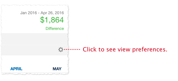
Click the gear icon on the far right of the budget view filter bar to see budget view settings.

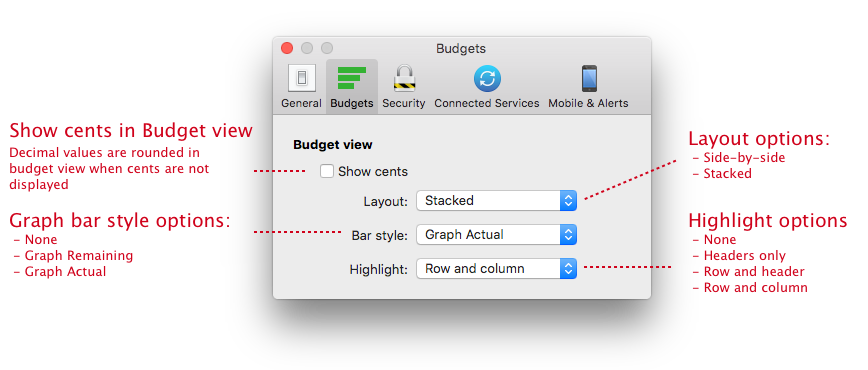
Budget settings are located in the main Quicken Settings window and apply to all budgets.

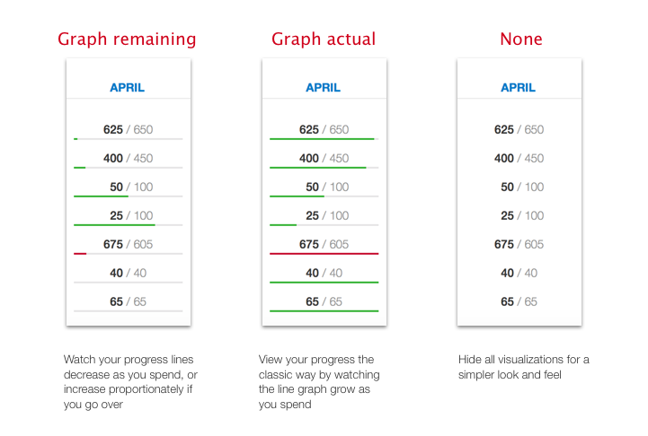
There are three graph options:

None – Displays no graph.
Graph Remaining – Graphs the value remaining or left over for the month.
For expenses:
This style starts full/green at the beginning of the month and gets shorter as you spend money.
If you go over budget, the graph starts building back up in red as you go further over budget.
For income:
This style starts full/red at the beginning of the month and gets shorter as your income is received.
If you get more income than you budgeted for, the graph starts building back up in green as you exceed your income targets.
This graph style always displays the proportion you are over or under budget, and generally the more green you see the better, as these indicate categories where you have not met or exceeded your budget. The more red you see, the more over budget you are.
If your budget is met exactly, the graph displays as a neutral gray color.
Graph Actual – Graphs the actual value spent (or received) for the month. This is the style that is always used on the 1-Month view and is found in some other budgeting tools.
For expenses:
This style starts empty and begins to turn green and gets longer as you spend money.
If you go over budget, the graph turns full red.
For income:
This style starts empty and begins to turn red and gets longer as you receive your income.
If you get more income than you budgeted for, the graph displays as full green.
This graph displays the proportion only as your spending/receiving income. Once you go over budget (or exceed your income target) the graph is “full” and no longer displays a proportional value.
We encourage you to play with the available options and choose the style that you like best.
Because of the proportional display of over/under values in the “Graph Difference” option (more green = good, more red = bad; little red = a little under; more red = a lot over), most of the Quicken team prefers this option. :-)
There are two graph layout options:
Side-by-side – The side-by-side layout displays the actual and budgeted values on the same line next to each other. This layout maximizes the vertical spacing of the view allowing you to see more categories on the screen at a time.
Actual / Budget
Stacked – The stacked layout places the actual value above the budgeted value. This layout maximizes the horizontal spacing of the view allowing you to see more months on the screen at a time.
Actual
Budget
There are four budget view highlight options:
The highlight feature displays a light blue background to rows and columns of the budget view as you move your cursor around the screen.
None – Displays no highlight.
Headers only – Highlights only the category name, yearly total and the month instead of the entire row or column. This is similar to a spreadsheet. If you move your cursor to a category or to a month then the entire row or column will be highlighted. Use this design if you find the light blue highlighting distracting but you still like to see the corresponding category or month that a number is associated with.
Row and header – Highlights the entire row and just the month header. In other words, the column will not highlight. This is a mix between the header-only and the row-and-column highlighting feature.
Row and column – Highlights both the row and column, making really obvious the row and column associated with a value. This was the favorite option of our beta testers but for some it was too distracting and they preferred one of the other three options.
The highlighting settings only work for the budget view. They do not work with the budget setup screen.
